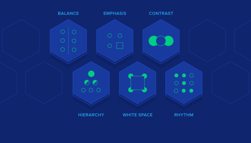
Like any other art form, graphic design relies on principles that guide composition and impact. These principles help designers create reports that are not only visually appealing but also easy to understand and remember. Whether you’re a business, researcher, or organization, applying design principles can elevate your reports from ordinary documents to powerful communication tools. This is where graphic design services become essential.
Why Design Principles Matter in Reports
Reports are more than data they’re stories waiting to be told. With the right visual design, complex information becomes engaging, easy to digest, and memorable. Visual communication cuts across barriers, helping readers retain insights and connect with your message.
Key Design Principles for Reports
Typography for Readability
Select fonts that are clear, professional, and aligned with the tone of the report. Maintain consistency in font size, style, and spacing to ensure a smooth reading experience.
Hierarchy and Layout
Guide readers with clear headings, subheadings, and bullet points. Use grids and columns to create a balanced structure that organizes information logically.
Strategic Use of Color
Choose a harmonious color palette that enhances readability and highlights key data. Colors can guide attention, create associations, and reinforce branding—just ensure accessibility for all users.
Data Visualization
Transform raw data into meaningful visuals like charts, graphs, and infographics. The right visualization makes complex insights easier to understand and more impactful.
Effective Whitespace
Allow breathing space around text, visuals, and sections. Proper whitespace prevents clutter and directs focus to the most important elements.
Consistent Branding
If the report represents an organization, align it with brand identity. Incorporate logos, brand colors, and design elements that reflect your values.
Imagery and Icons
Use high-quality images and icons to break up text and add interest. Visuals should support the message and create emotional engagement.
Alignment and Proximity
Keep elements neatly aligned and group related items close together. This creates order, professionalism, and a polished look.
Text Legibility
Optimize line spacing, paragraph length, and font size for comfortable reading. Avoid small, dense blocks of text.
Accessibility First
Design with inclusivity in mind. Use descriptive alt text for visuals, provide text alternatives, and choose high-contrast color schemes for visibility.
Feedback and Iteration
Strong design is iterative. Gather feedback from peers or clients and refine the report to improve clarity and aesthetics.
Role of Graphic Design Services
While you can apply these principles yourself, professional graphic design services bring expertise that ensures precision and creativity. Designers can tailor layouts, data visuals, and branding elements to make your reports not just informative, but inspiring.
Conclusion
In today’s information-heavy world, visually appealing reports leave a lasting impression. By applying core design principles typography, layout, color, and visualization—you can turn routine documents into engaging stories. Partnering with graphic design services ensures your reports are impactful, accessible, and memorable for any audience.
Suggested Read: Tools and Tips for Streamlining Your Design Workflow


